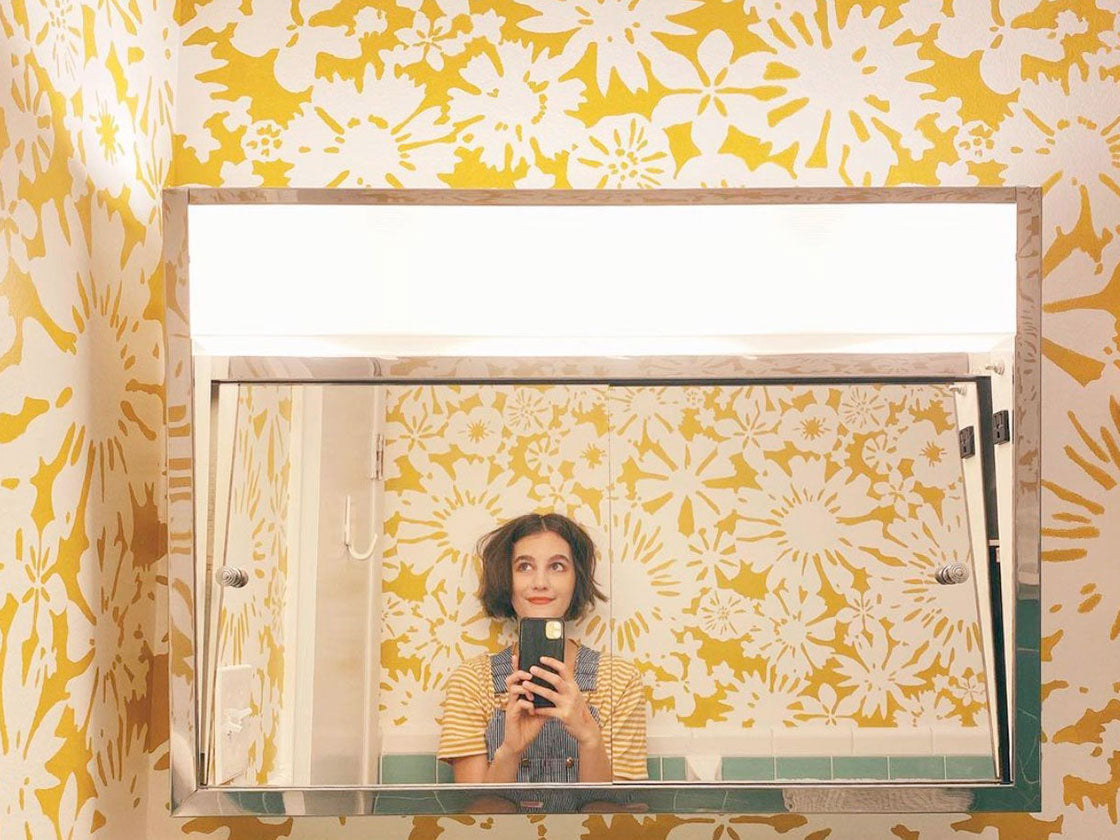
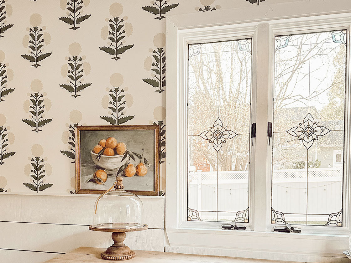
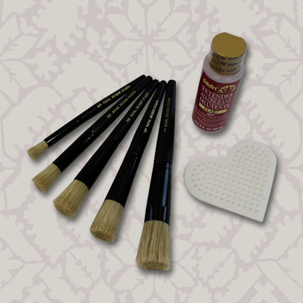
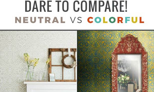
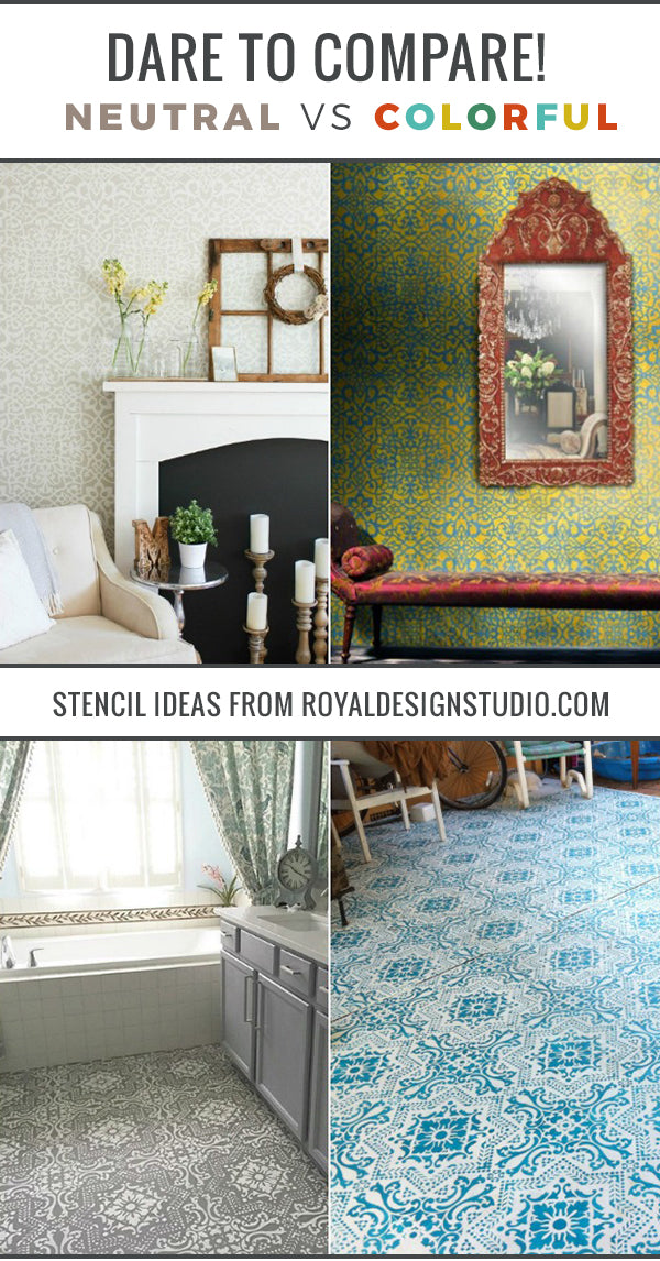
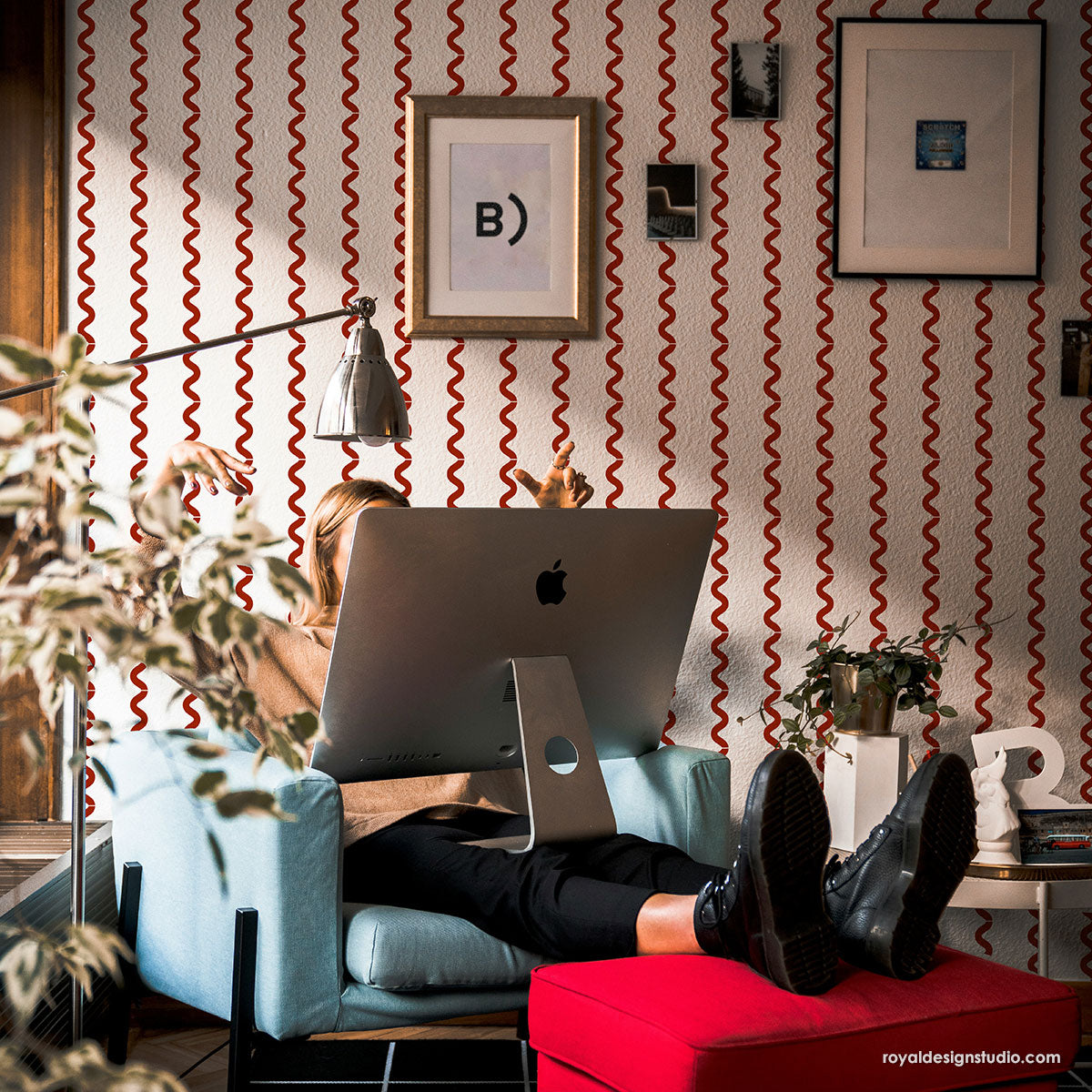
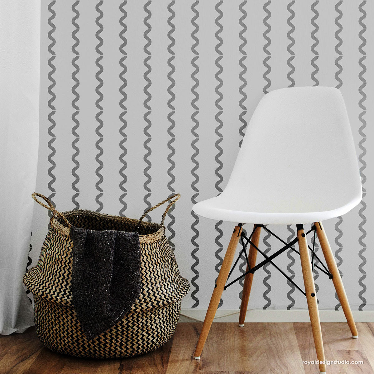
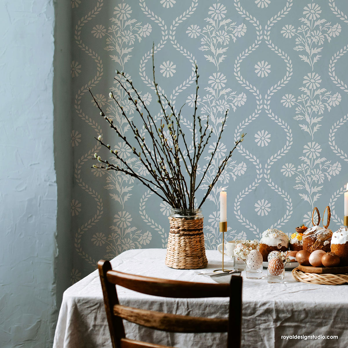
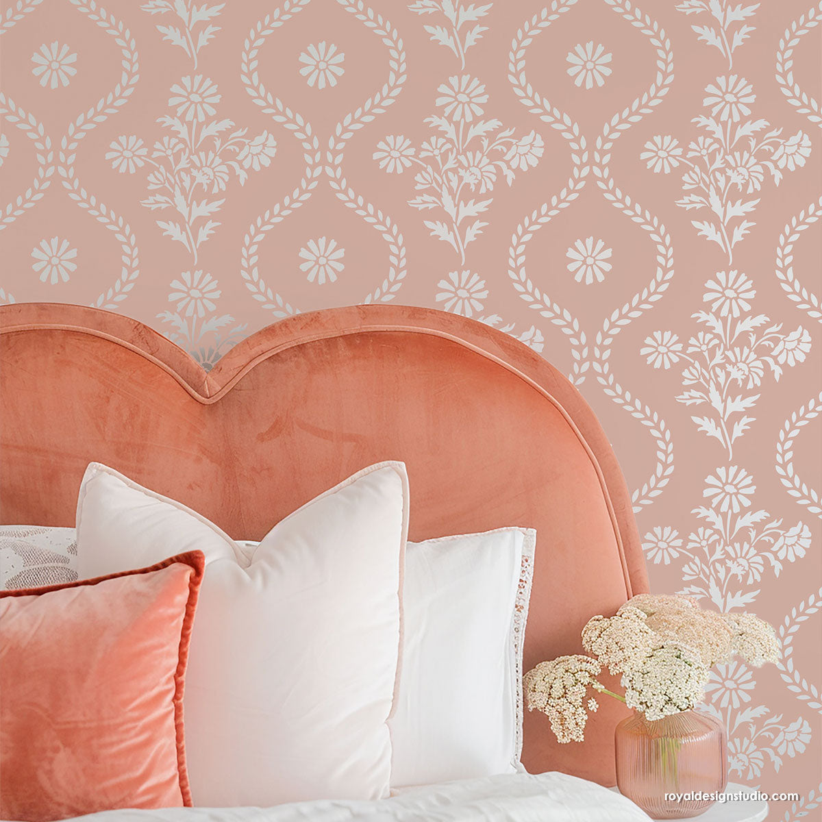
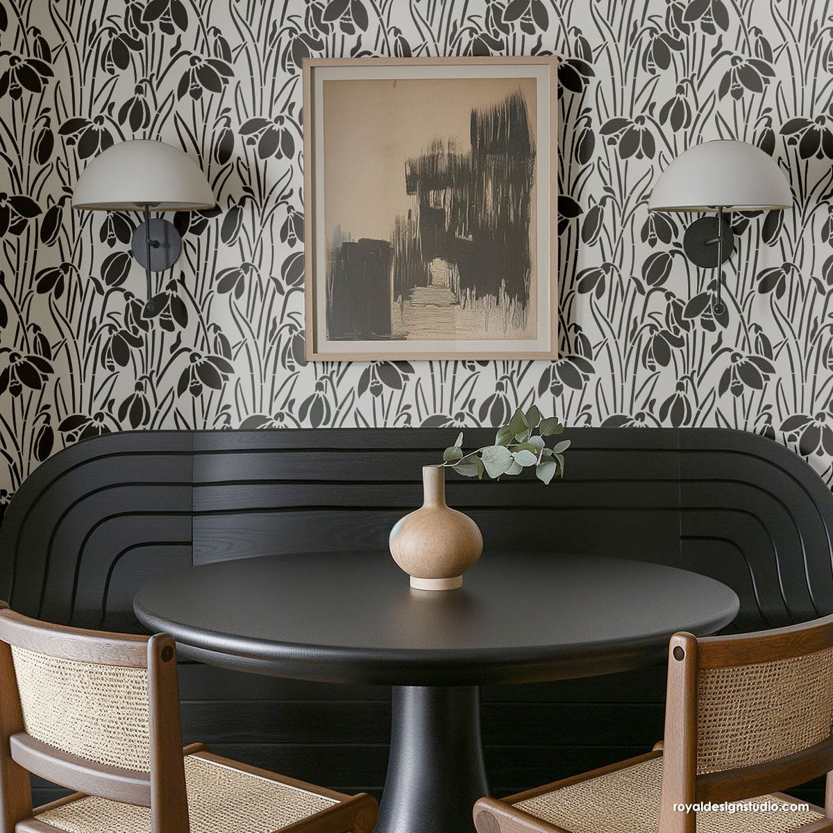
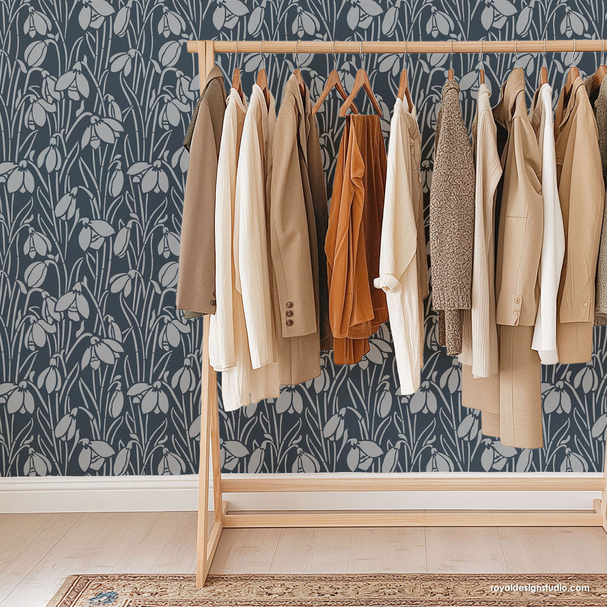
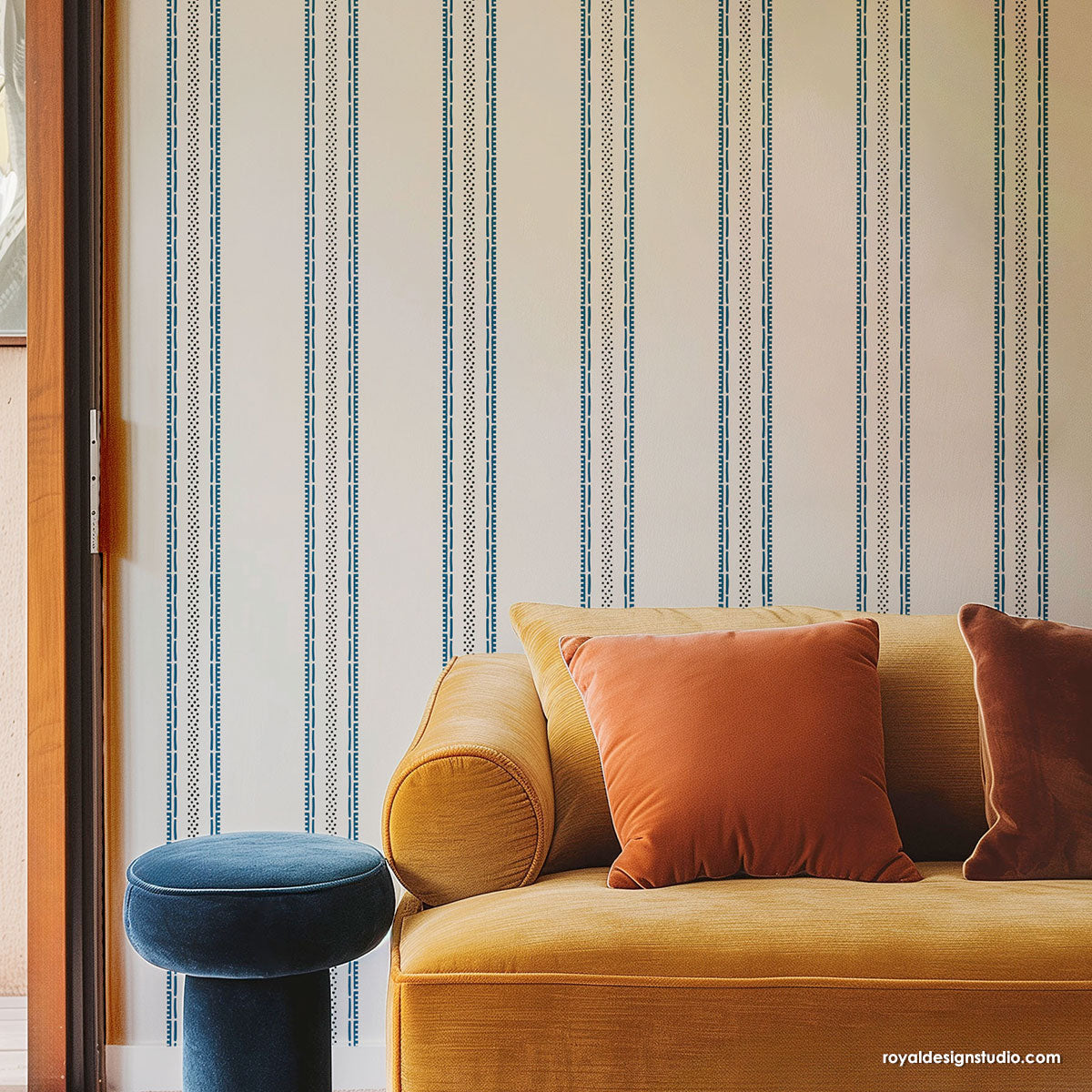
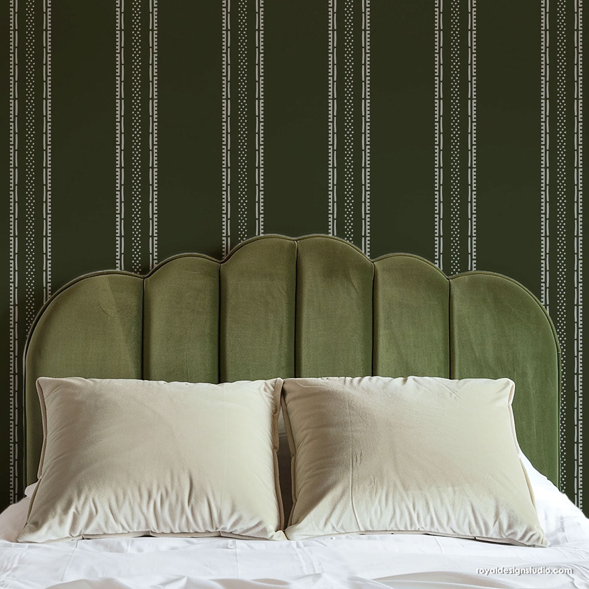
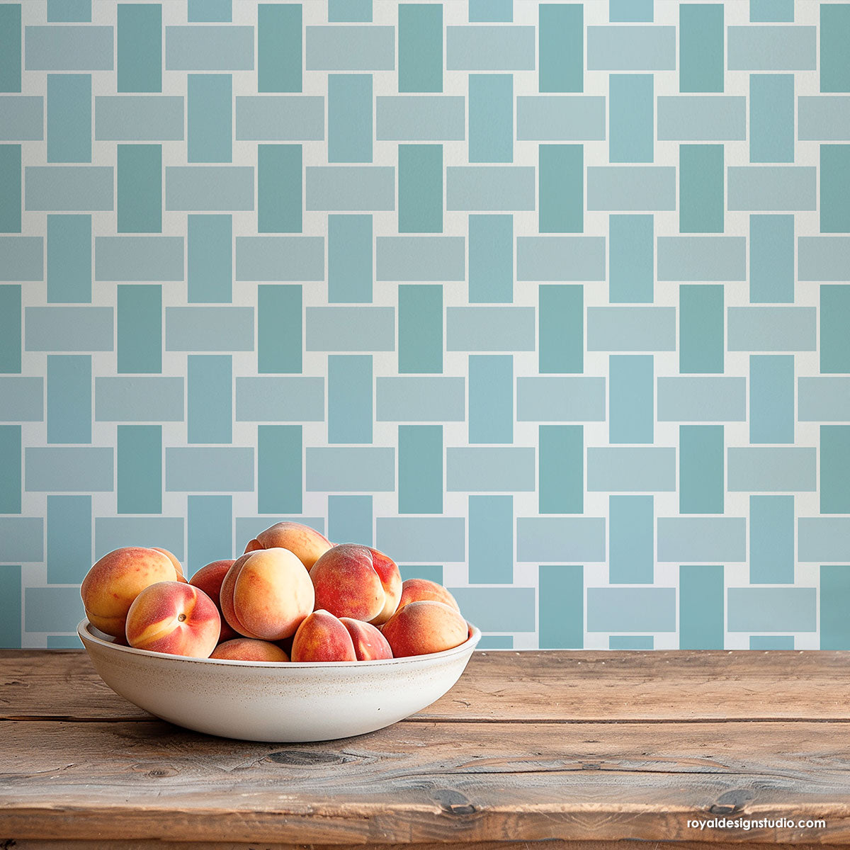
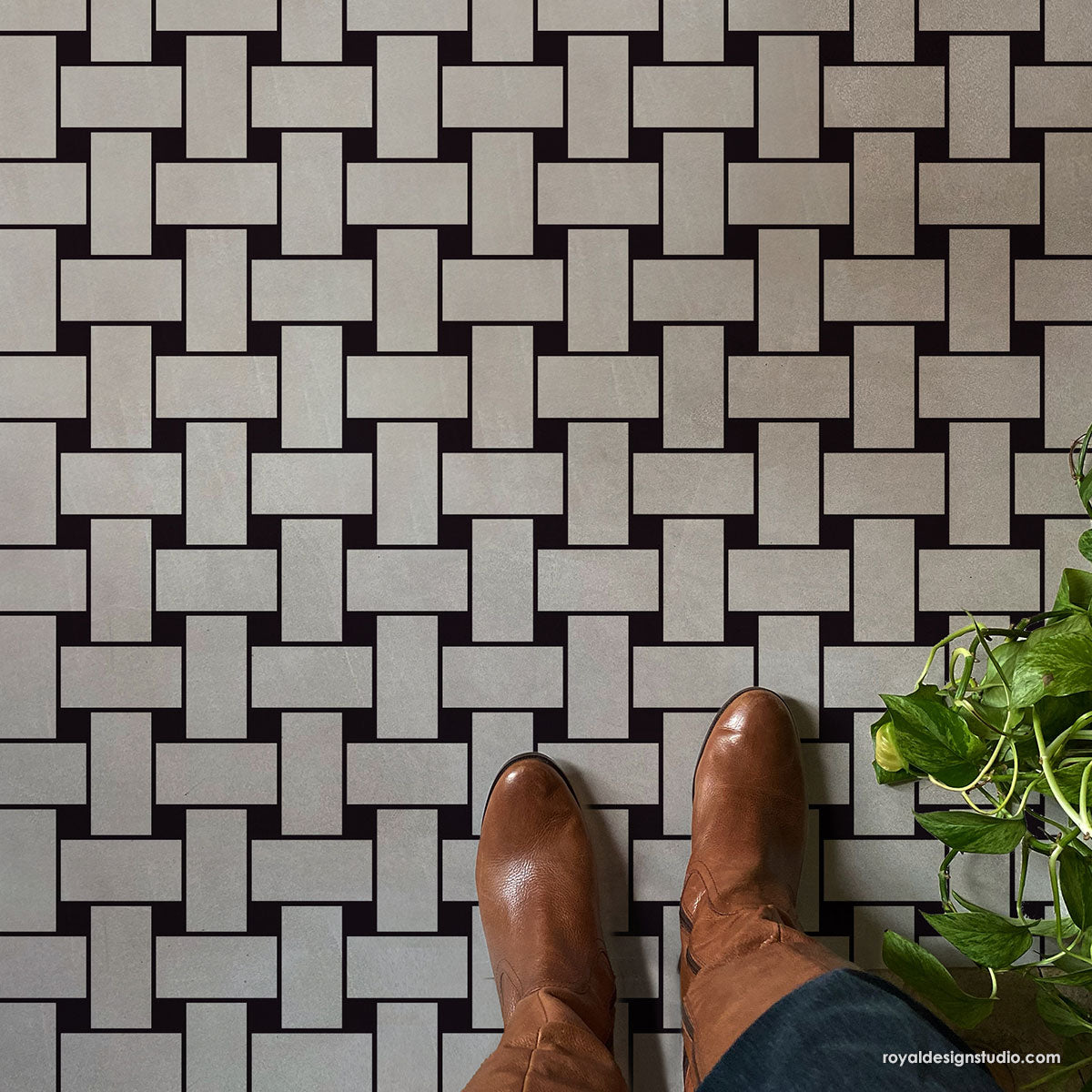
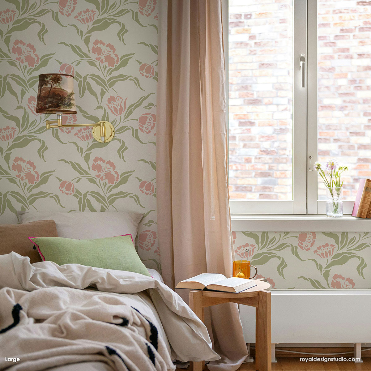
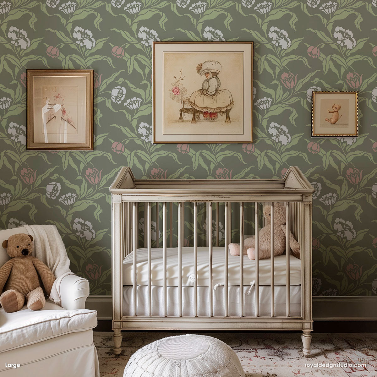
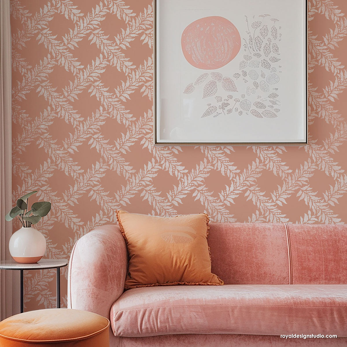
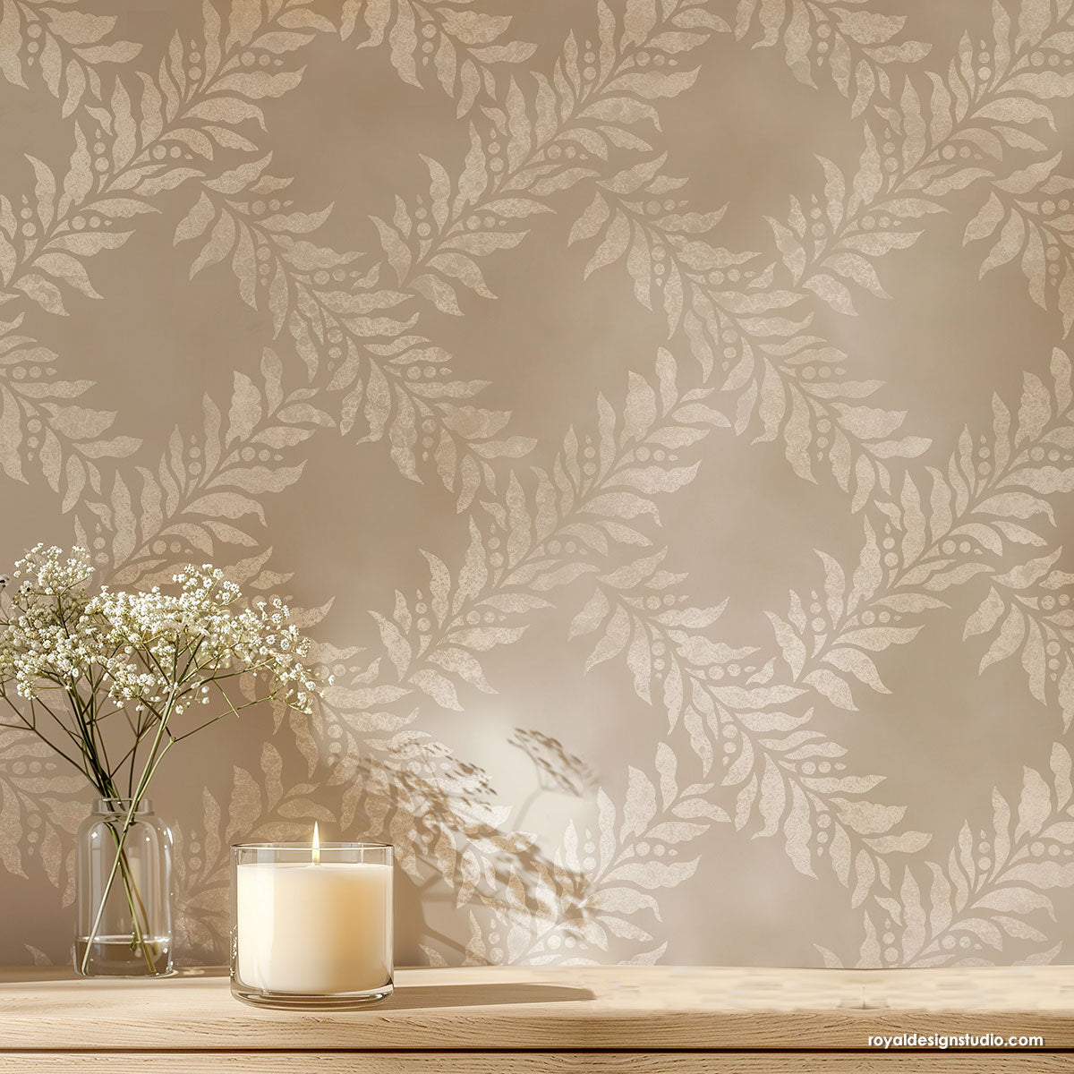
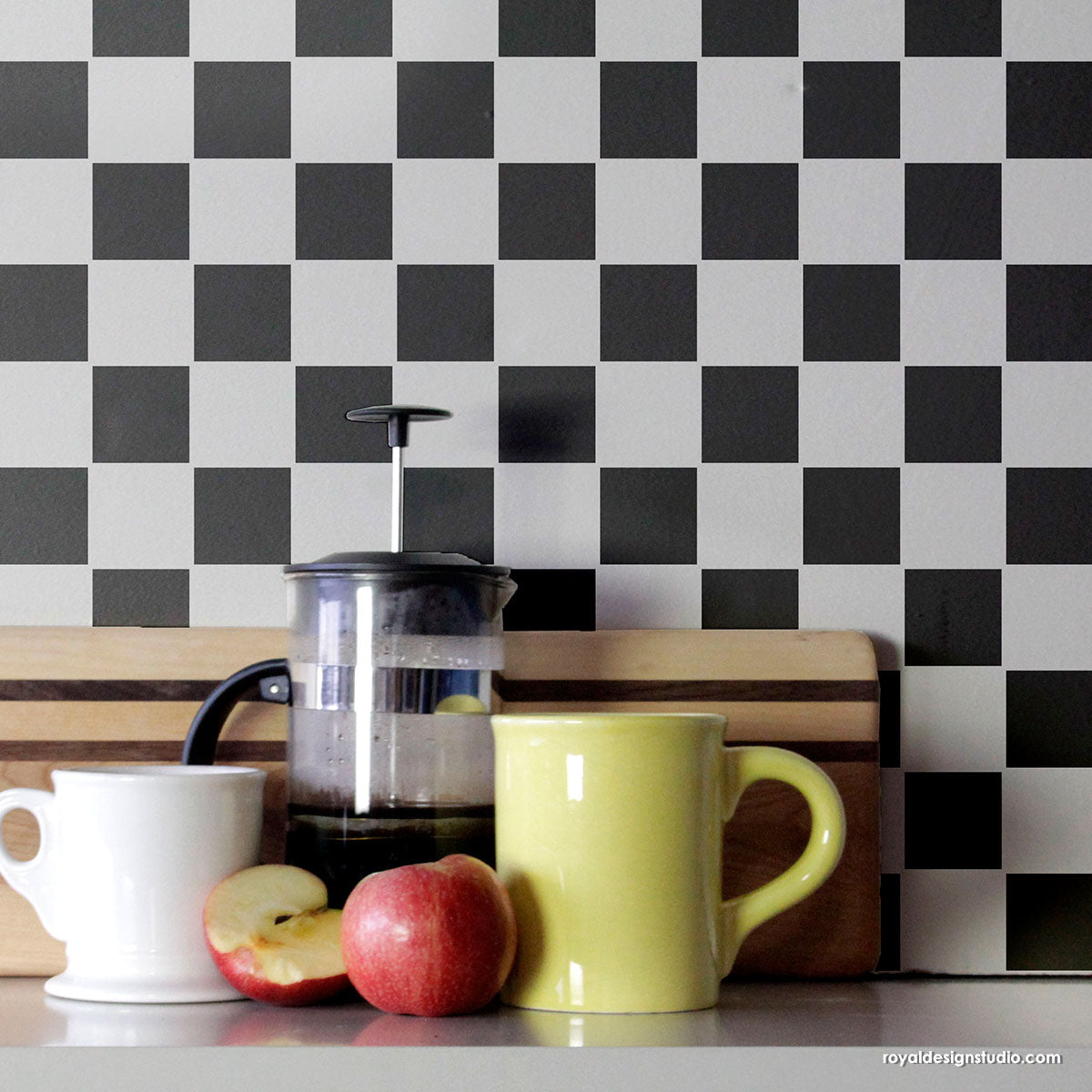
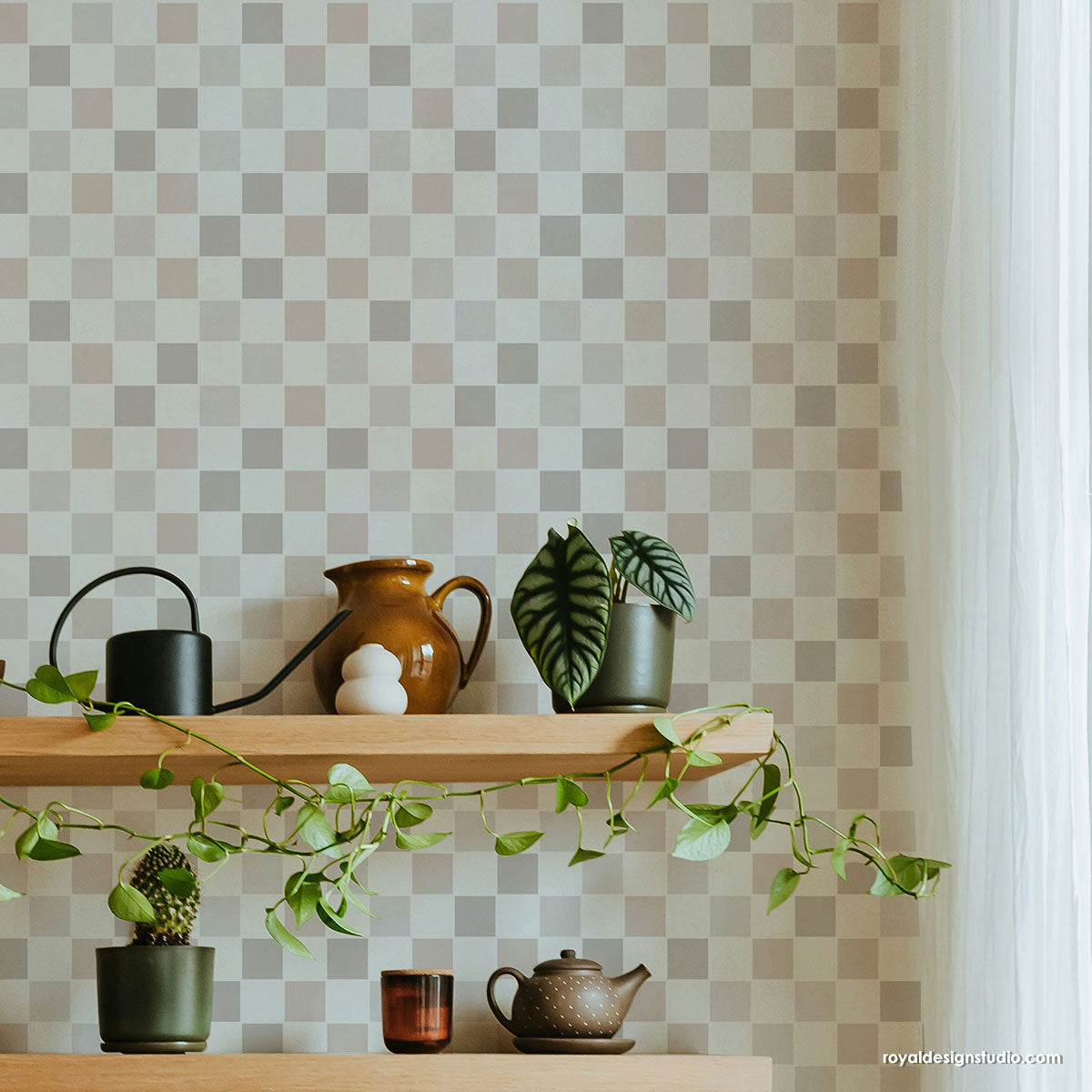
Do you embrace color, or hide from the wilder hues? Colorful vs neutral in interior design is a never-ending design choice, and here at Royal Design Studio we find ourselves on both sides of the room! Neutral colors are subtle, blend well, and can compliment rather than compete with other room elements. Bolder colors are vivid, show personality, and stand out. Either color scheme can work well in an interior especially when paired with pattern. And the EASIEST way to do THAT is with Stencils. Stencils painted onto walls, floors, and more can liven up an otherwise boring neutral or soften an intense color.
Are you in Team Neutral, Team Color, or do you play a little with both? Let’s compare some stencil designs that look gorgeous in both neutral and color interiors...
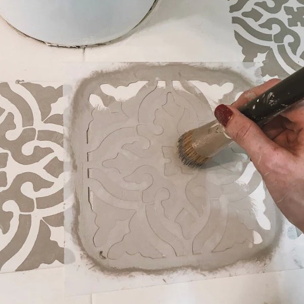
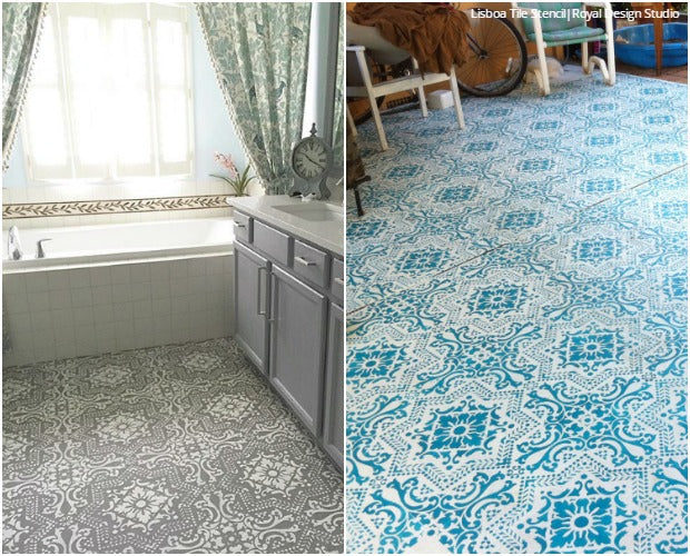
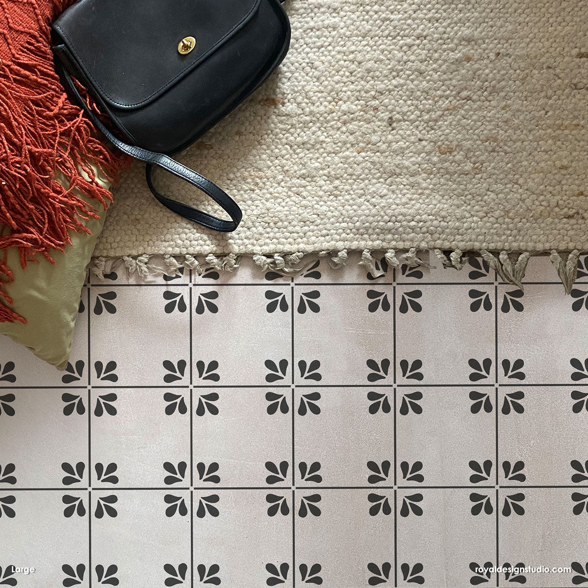
Our Lisboa Tile Stencil makes any floor look ravishing and it’s pretty easy to do too! Kimberly Shadoff says, “We didn’t have it in the budget to change out the icky vinyl flooring in our master bath, so I got crafty and stenciled right over that bad boy!! With Chalk Paint® and a beautiful stencil from Royal Design Studio, I’m now in love with these floors!” But if neutrals make you feel blue, then feel free to kick it up a notch! Fran Joubert painted her concrete patio to bold blue brighten up each space, lighten up the mood, and make it look absolutely YUMMY!
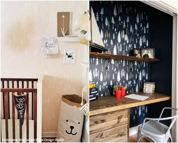
Bonnie Christine of Going Home to Roost designed her Timberland Wall Stencil with her baby son and his adventures in mind. She painted the tree design in soft cream and beige in his nursery, to lull her little adventurer to sleep. Some areas call for neutrals, but some yell out for more color! A bold stenciled wall is key to making an area a creative and productive workspace! The Happy Housie decorated her sons’ closet-now-desk with navy blue and pops of metallic and they are thrilled!
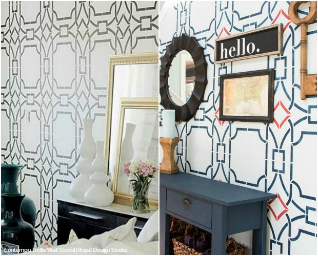
Our Contempo Trellis Wall Stencil is a large-scale pattern that blends beautifully with different design styles. Janice Lombardi Designs used a black and white color combo with this wall stencil, which we see a lot and is quite timeless. Her stenciled accent wall is simple and classic with a touch of glam. However, Designer Trapped in a Lawyer’s Body thought her own foyer was beige, blah, and BORING. She finally said enough was enough when planning out her foyer transformation. She says, “Y’all know I love color and pattern, right? So it should be no big surprise that I am a BIG fan of stencils. They can completely transform a wall without the commitment of wallpaper.” After a few short hours she now has an entry what welcomes guests with a bold “Hello!”
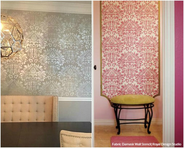
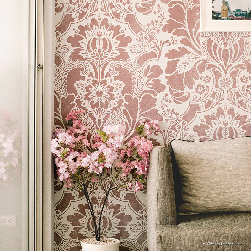
Alana and Khalid used a damask pattern in different ways in their rooms… and both LOVE it! Gray and silver, paired our Fabric Damask Wall Stencil in dining rooms instantly creates the look of traditional elegance. The white trim brings along a sense of refinement that pairs well with a nice dinner! Then take a look at the glamorous second room… This foyer is pretty in pink – and pattern! Our damask pattern makes a grand entrance in this hot hue.
Our All the Right Curves Damask Wall Stencil gave these two rooms a much-needed dose of fresh style! Heather Adams Forney’s bathroom is painted in gray and silver, making it style versatile and sophisticated. This way she can change up the room’s accents easily when she wants to change up her style. To make more of an impact in this bedroom, Heather Bruno-Sears stenciled this elegant and sultry wallpaper-like pattern in a bold eggplant color. Drifting off to sleep would be easy if you were surrounded with this rhythmic wall design and a dose of regal elegance.
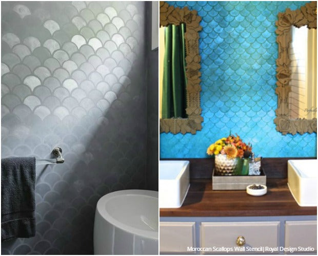
Our Moroccan Scallops Wall Stencil creates an easy and affordable faux tile look. Designer Caroline Lizarraga paired this pattern with Modern Masters Venetian plaster to create an art deco feel in this beautiful gray powder room. The metallic finish shines on certain scallop designs depending where the light hits it – it’s like having multiple neutrals but with a single paint! But check out how Designer Kara Paslay took this pattern one step further! The scallop design immediately reminded Kara of the ocean, so she ran (or swam!) with the idea and created an iridescent blue fish scale look in a beach themed bathroom.
Elegant Finishes by Gina gave this dreamy bedroom a comforting feel with whites, creams, and our Ribbon Lattice Wall Stencil. In contrast, when this wall stencil is painted in lush purples and paired with spring flowers, the room feels refreshing and gives a great start to the day! The purple accent wall above adds richness to the otherwise architecturally simple kitchen.
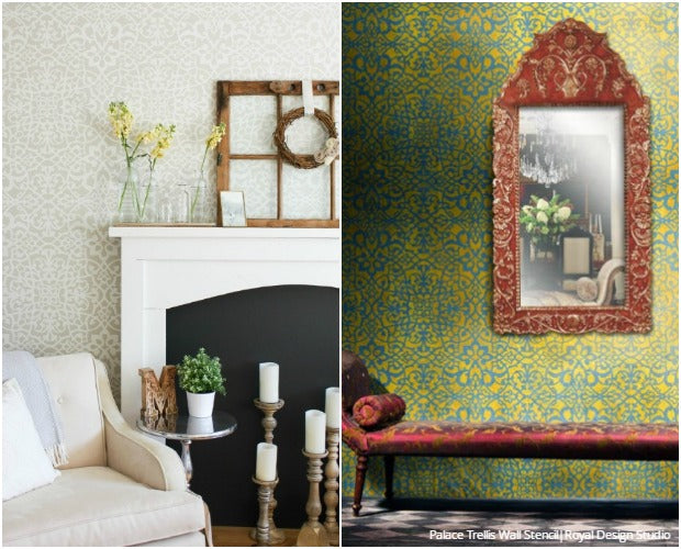
Whatever style you are decorating for, you can finish off the look with wall stencils. In Making It In The Mountains’ case, she wanted a rustic, yet classic farmhouse style for her master bedroom. With a neutral color palette and delicate Palace Trellis Wall Stencil pattern, she made the room a comfy, cozy, and luxurious retreat. On the other hand, this wall stencil can be paired with vivacious metallic Royal Stencil Cremes to accentuate its Moroccan trellis pattern. This space looks like a regal Moroccan palace!
Tell us, when choosing paint colors for your home, do you prefer vibrant colors or more subdued neutrals? Maybe you're living in a white walled space and are dreaming of creating some high impact walls with bold colors. Or maybe color is just not your thing at all and you like the look of all muted tones. Whichever team you side with, just know that Stencils add the much needed depth and pattern you need to decorate your home like a pro!
Here are a few Stencil Ideas and DIY Tutorials for more inspiration:

